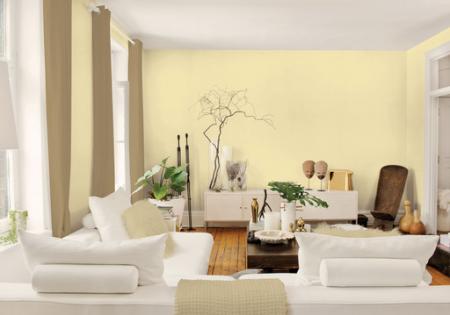
A shade of pale yellow described as “a soft, but energetic buttercream” known as Turning Oakleaf has been named 2014 Colour of the Year by the world’s largest paint supplier, Pittsburgh Paints (PPG).
A spokeswoman for PPG, Dee Schlotter, said they expect the colour to have a prominent role in home décor in the coming year as part of their forecast for use of brighter, more optimistic colours among homeowners.
“Refreshed thinking is driving homeowners to unwind from their stressful lives and seek colours that emphasise enlightenment,” according to Ms Schlotter.
“Incorporating colours into the home that illustrate hopefulness in society, such as Turning Oakleaf can transfuse a room with brilliant energy.
“Homeowners have moved away from the muted hues influenced by economic factors in recent years. Turning Oakleaf, which is soft enough to be a neutral but bright enough to generate a sunshine-like energy, represents a trend toward warmth in harmonious living, deep appreciation for the surrounding natural elements and a thorough understanding of enlightened philosophies,” said Ms Schlotter.
“We are experiencing the popularity of the soft yellow shade across all markets, such as home décor, automotive and electronics, making it a clear Colour of the Year selection.”
PPG employs more than 20 colour stylists around the world, each specialising in different markets, who collaborate to determine styles and colour trends for the home, consumer products and automobiles.
“With today’s 24-hour connectivity and on-the-go lifestyle becoming more and more common, homeowners are transforming their living spaces into comfortable retreats with colours that represent how individuals perceive their ideal form of relaxation,” Ms Schlotter said.
“For some, the back-to-basics feel that captures an earthy, primitive and organic reference is the natural influence needed to pause from today’s technologically-driven lifestyle. For others, bold, dynamic colours mixed with artisan patterns, shapes and prints generate an atmosphere that is lively, vibrant and creatively energising.”
The key trends are presented in five-colour palette cards that create opportunities for all design elements in a space, including window treatments, flooring and fabric. The five palette cards are comprised as follows.
Earthy and Primitive
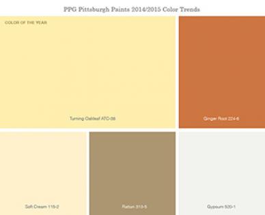
This trend focuses on the new consciousness of earth and organic references. A calm and modern approach to colour captures earthy tones for a relaxed atmosphere, combined with the raw colours of the great outdoors. Bringing fresh colours from the surrounding environment inside evokes a renewed outlook and primitive feel. Earthy décor displayed with a clutter-free style and back-to-basics wooden floors and brick walls bring this palette to life.
Features: Turning Oakleaf, Soft Cream, Safari, Rattan and Seasoned Acorn.
Organic and Man-Made
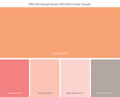
The intersection of the organic and man-made worlds creates a palette of colours that work in harmony to capture both realms with soft yet lively colour options. Various shades of soft pinks and creams are accented with a brighter shade of orange. The palette captures the manner in which technology and nature work in harmony by incorporating the dark grey of city streets into the natural hues of flowers and springtime landscapes.
Features: Orange Liqueur, New Clay, Ballet Slipper, City Street, Cranapple
Bold and Dynamic
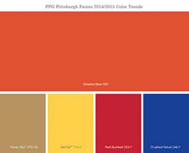
This palette is a wealth of artisan patterns, shapes and prints that weave together to express a creative future. Bright colours paired with vibrant décor create a digi-art feel. The palette is all about an expressive, live-out-loud theme that homeowners can use to unleash their inner originality and imagination.
Features: Del Sol, Honey Bun, Cinnamon Stone, Red Gumball, Bright Cerulean
Lavish and Historical
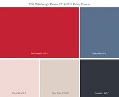
The blending of magnificent and elegance creates this palette, full of opulent, dramatic colours. With classic black and white décor and accents of vivid hues coordinated with soft neutrals, this palette can help homeowners design lavish rooms with elegant contrast. Extravagant décor creates a historical, yet theatrical theme with the soft and bold colour combinations.
Features: Napoleon, Stained Glass, Red Gumball, River Rock, China Silk
Clean and Minimal
This trend is carefully calculated to evoke precision with clean, minimal design. Contemporary décor and fresh colours create an energising space free of clutter to allow for ultimate relaxation. This edited point of view helps homeowners cut through the chaos of everyday life and enjoy a space that is carefully balanced with clean, rejuvenating colours.
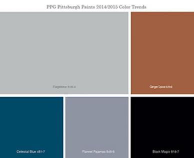
Features: Flagstone, Celestial Blue, Flannel Pyjamas, Black Magic, Ginger Spice




__small.png)


