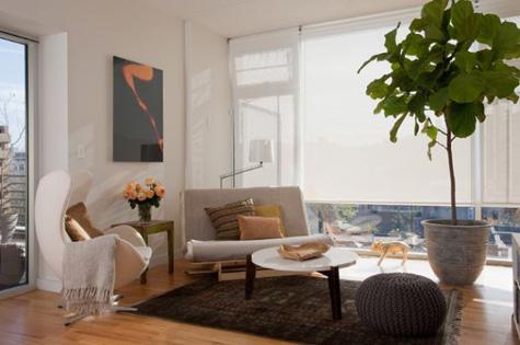
From the everyday renovators on TV shows to the interior design blogs and magazines, styling and decorating your home no longer looks out of reach! But even with all these great resources, people still make mistakes.
After all we’re not trained designers. So here are three errors rookies often make and how you can avoid them.
1. Less is more
Accessories and styling items can truly make or break a room, however, most often these pieces are given the least amount of attention.
People get carried away with transforming an entire room that when it comes to the crucial stage of styling, all items get thrown together last minute. Therefore, the end result can look unnecessarily busy and haphazard and ruin an otherwise well balanced and inviting space. So make sure to plan those styling items well in advance and give careful thought to what accessories and soft furnishing you actually need. Less can truly be more!
2. Don’t be emotionally attached
Everyone can get a bit too emotionally attached to a certain accessory, whether it is an obsession with miniature dolls or a love of the colour yellow. And while giving you room that personal touch is great, when they’re overused it can create a sense of imbalance and can even look a little OTT!
So channel your professional stylist and detach yourself from all personal effects. Do these decorative pieces actually look good in the space or are they just something you like in isolation?
3. Prioritise function
Often people will use impractical accessories or place their items in a certain way that focuses on the beauty of the room while impeding the room’s actual ability to function. This is a big no no!
Function is just as important as visual appeal. When using accent items, which are more about aesthetics rather than function, be sure that their inclusion isn’t disrupting the use of the room. So for instance, no tables in the hall that require you to turn sideways to fit past and no vases or breakables in a busy throughway of your home.
When you get to the stage of styling your space, just remember these three errors and how to avoid them. The aim is to create a space that shows your personality, yet is still well balanced, functional and inviting.


__small.png)


